
· By Otto Gossamer
Pantone Matching Your Artwork To Embroidery Thread
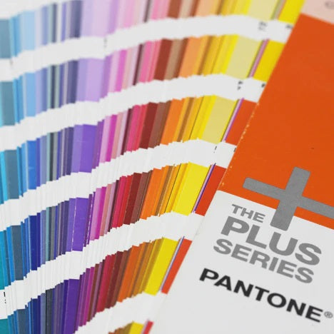
Most people aren't sticklers when it comes to matching colours exactly. I'm not one of those people. I think it's extremely important, especially for companies, to keep within their brand guidelines. Pantone, the granddaddy of all colour matching guides, was designed specifically for this purpose. You as a consumer, can take your artwork to nearly every print house, embroiderer, and graphic designed all across the globe with your Pantones and get the same exact colour every single time. Until the early 1960's, that wasn't possible at all. Let's jump in to the easy task of taking an example piece of artwork and matching it.

I'm sent the above artwork with specific instructions. That blue must be Pantone matched to 647C. The first question I ask myself when a customer sends me artwork is, "Do I have these colours?" 95% of the time, the answer is yes. That other 5%, I'm sitting down hunched over a Pantone Coated colour guide and a Madeira or Robison-Anton thread book trying to pick what colour works best.
Even though there’s a lot of thread to Pantone matching guides from various thread manufacturers, the colours they pre-assign aren’t always the perfect match in comparison to other colours they have available when the Pantone swatch is held up to the thread sample book.

You'll only be able to get so close with exact matching of Pantones to threads, but in terms for "pretty close", I think Madeira Polyneon 1776 is as close as it could get to 647C for the blue.

The next step comes the digitizing of the artwork, getting it onto the machine and finally sewing it out. Once is all said and done, the patch comes out looking like this.


It's a bit more effort to perfectly match something up perfectly, but at the end of the day it's worth it if it's exactly what a customer wants.